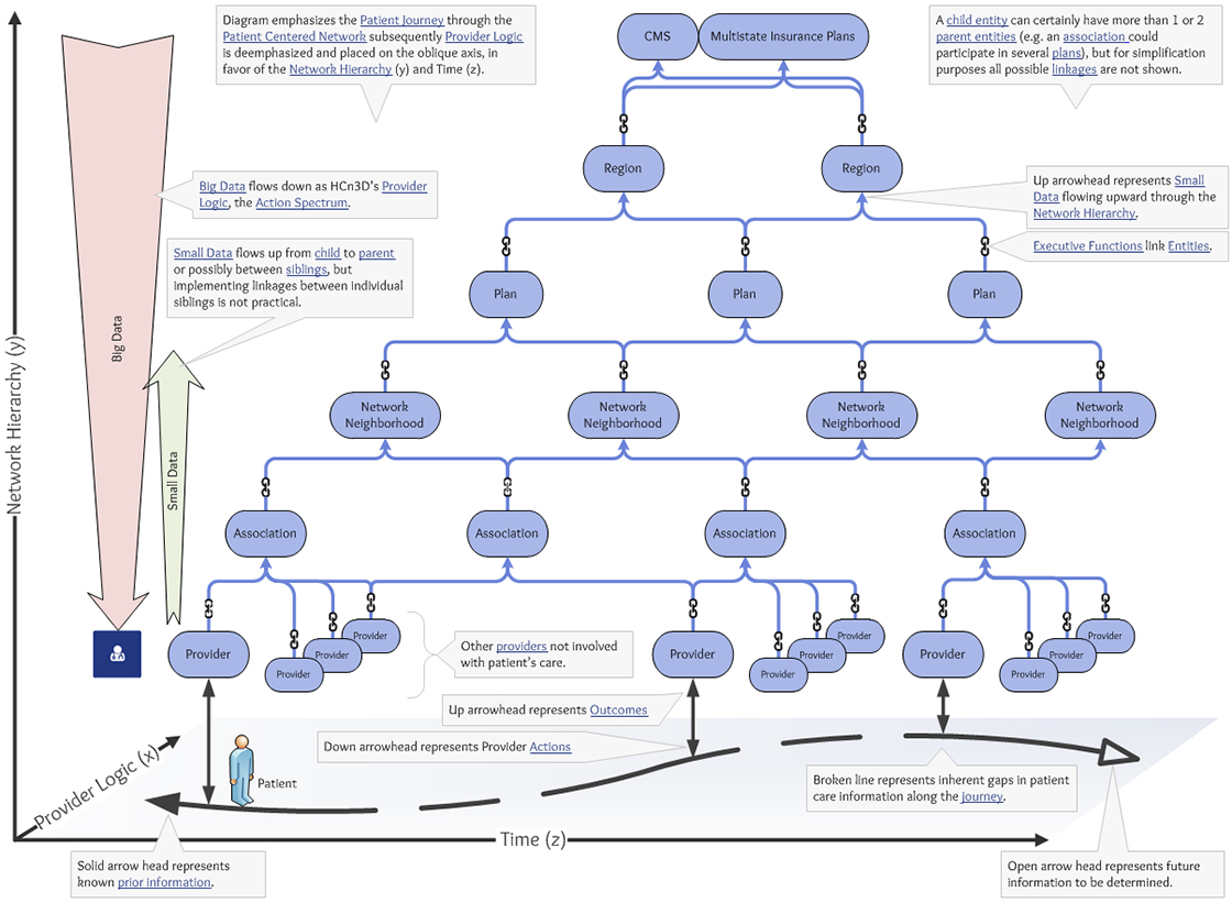
This illustration emphasizes the Patient Journey through the Patient Centered Network (x). Provider Logic is deemphasized and placed on the oblique axis, in favor of the Network Hierarchy (y) and Time (z). Note: The “Population” is not shown because it is not a network entity that links to other entities. Instead it is a grouping of all entities. Conceptuality it would be located at the highest level above CMS and Multistate insurance plans.

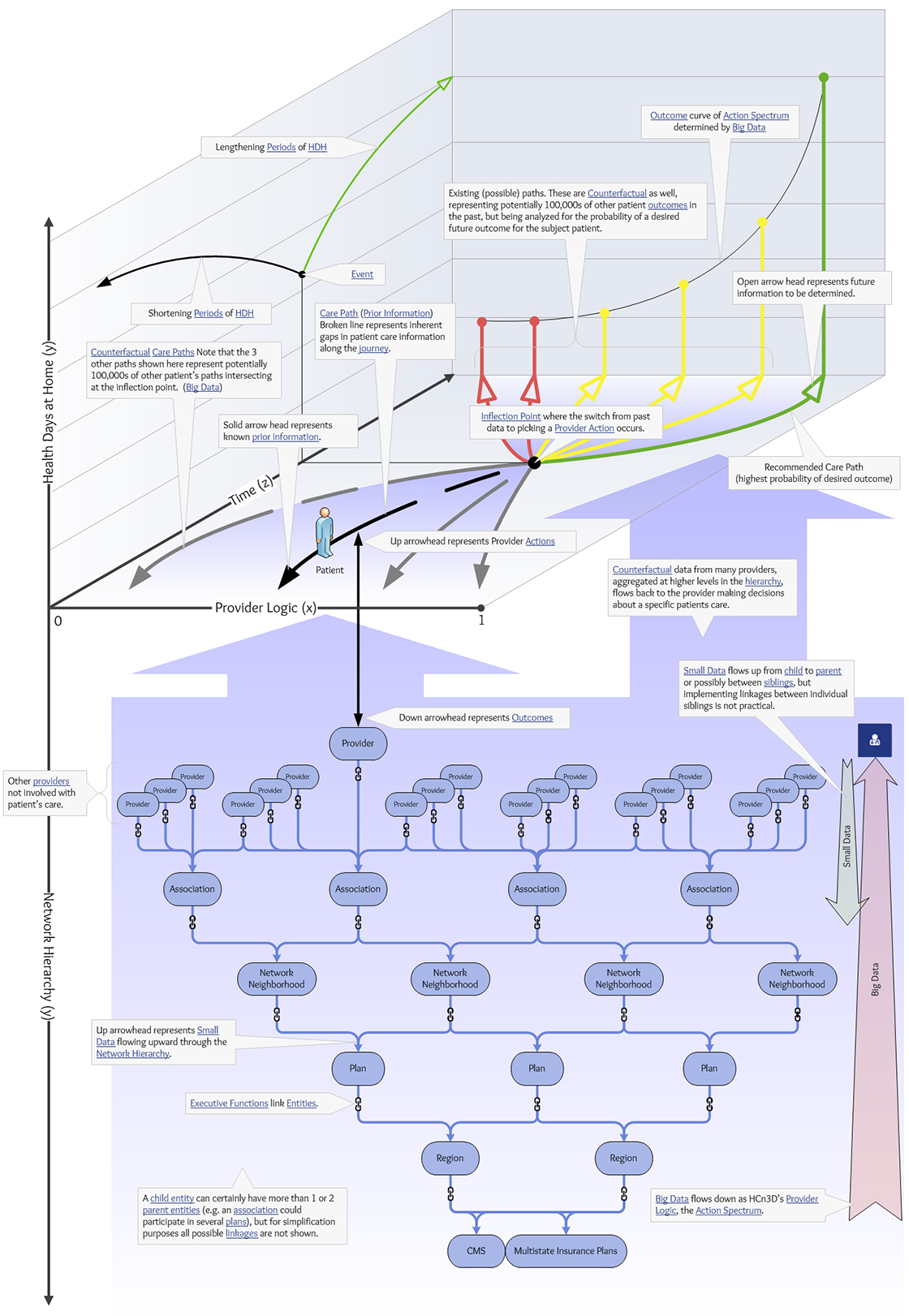
This illustration emphasizes the application of Big Data as Provider Logic in the Patient Journey and the flow of that data in the Network Hierarchy. Note: The “Population” is not shown because it is not a network entity that links to other entities. Instead it is a grouping of all entities. Conceptuality it would be located at the highest level above CMS and Multistate insurance plans. Also note that in this diagram the hierarchy is inverted.
For an animated primer on the function of the cube illustrated below see The Patient Journey Through the World of Health Care in 3D located on the Videos page.
